RECOMMENDED BY
“RECOMMENDED BY” HUMANS
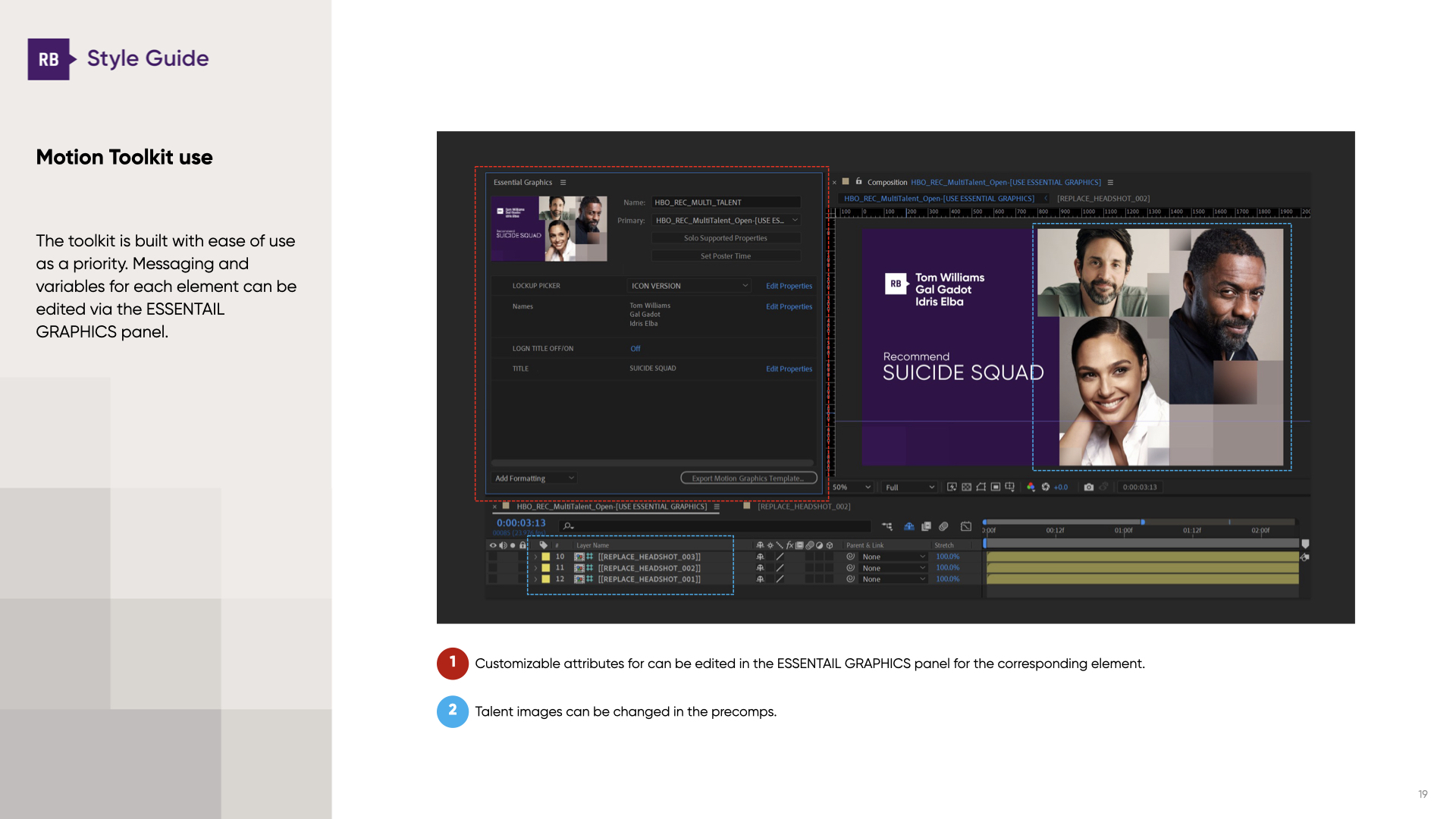
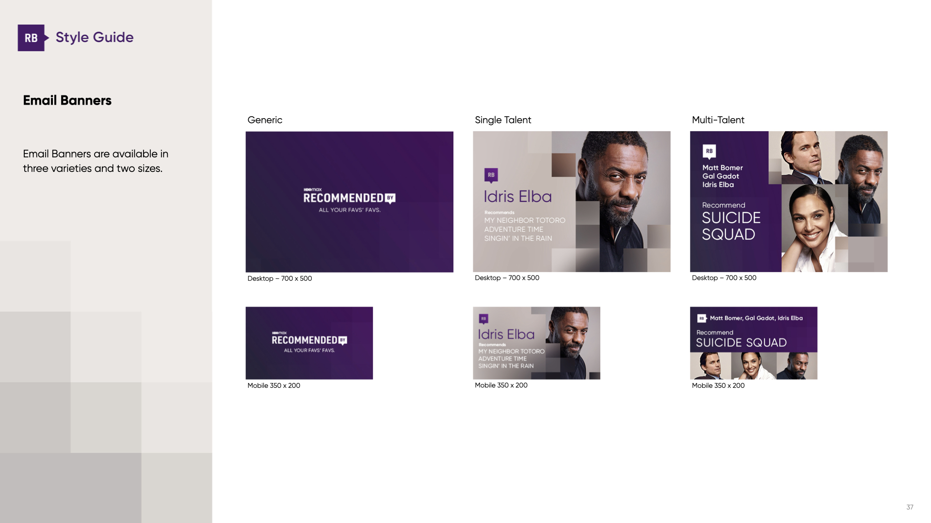
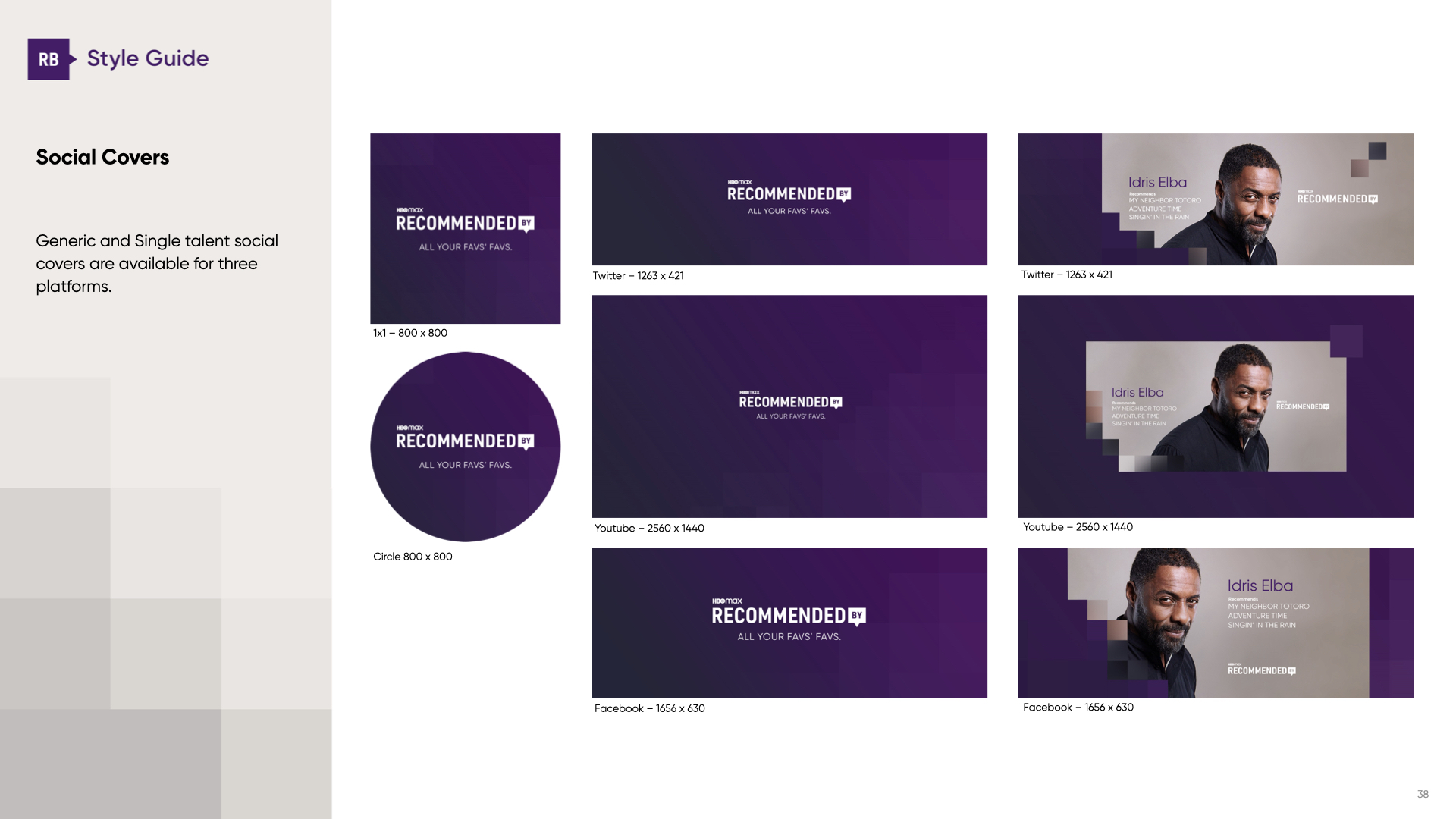
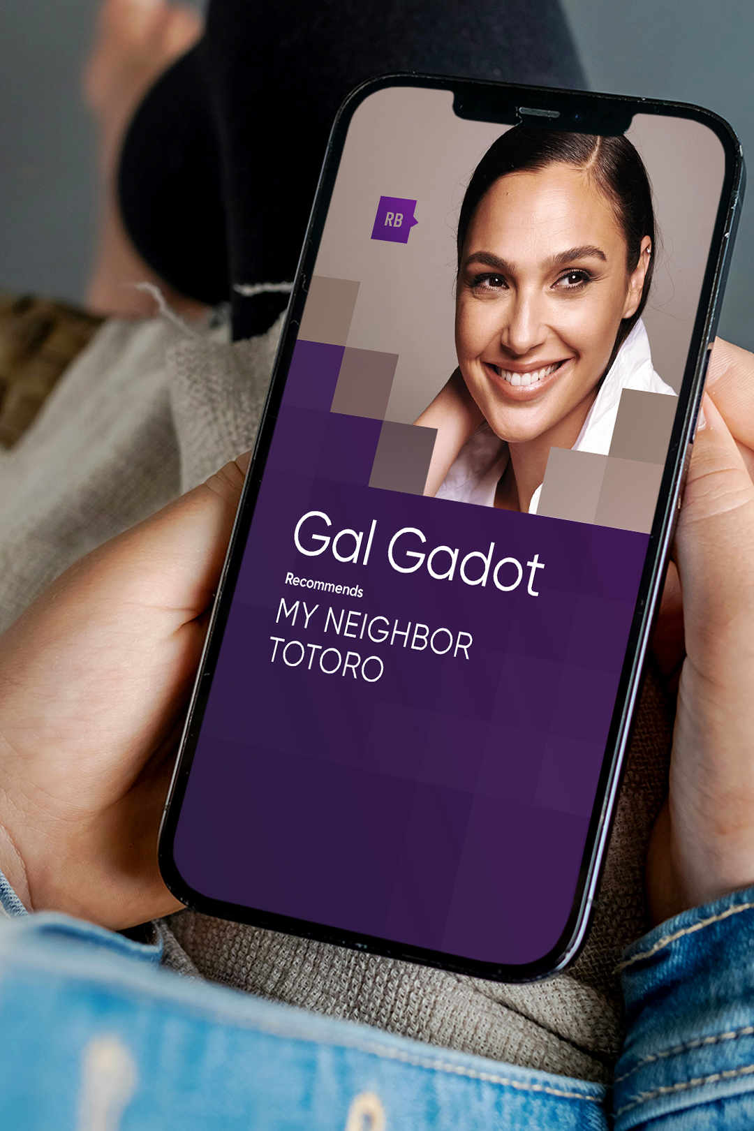
HBO MAX launched “Recommended By” as a way to put a human face back into streaming. Instead of an algorithm spitting out suggestions, audiences got personal picks straight from HBO’s top talent, sharing the shows and films they actually watch themselves. Each recommendation became its own piece of content, which meant the brand needed a packaging system with real range. Something that could flex from a single talent spotlight to a panel of three, and live across every platform from TikTok to YouTube to social covers and icons.
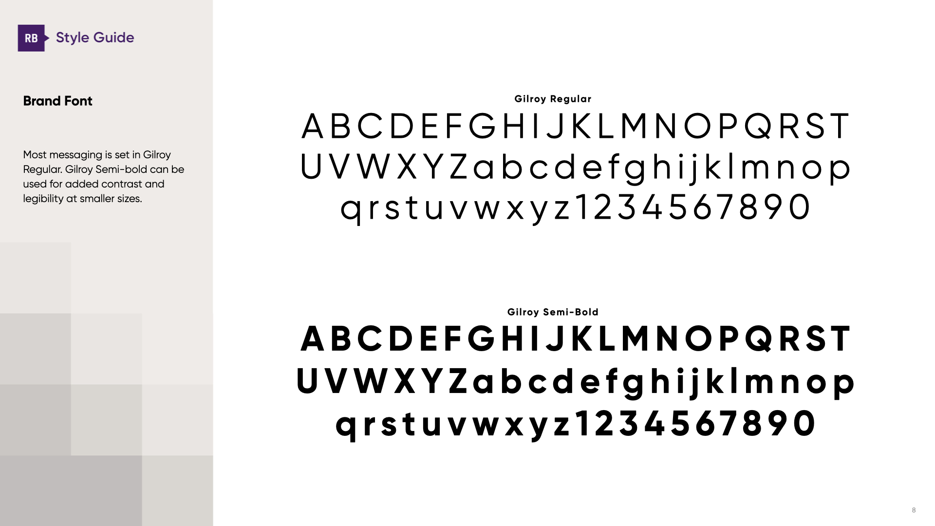
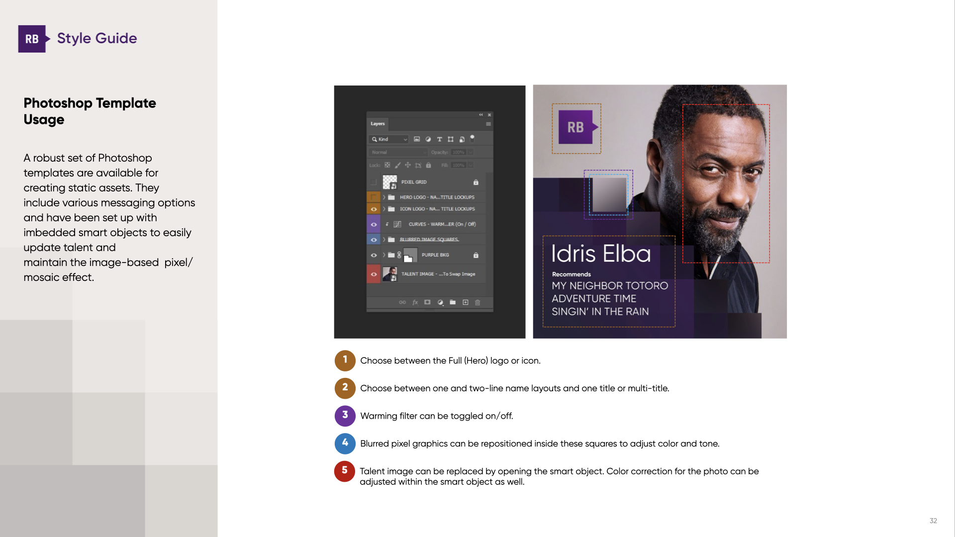
We built that system. Logo design, brand development, art direction for photography, motion and static templates, social toolkits, and a full style guide. The works. A wide-ranging package that let HBO Max spin up new content quickly, while keeping the identity tight and unmistakably theirs.
ANTI-ALGORITHM
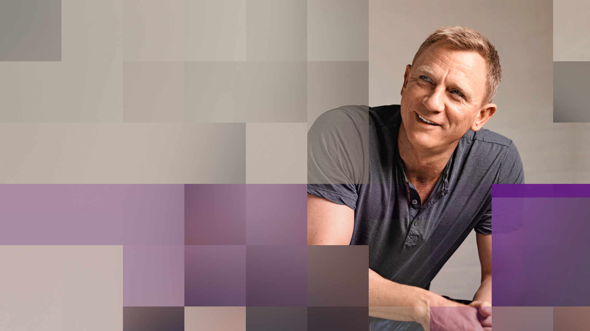
Our concept pushed directly against the algorithm. A pixelated visual device acted as the foil: cold, digital, automated. But then it fractured and peeled back, revealing real people sharing their own viewing habits. That tension — computer vs human — set the tone for the whole package.
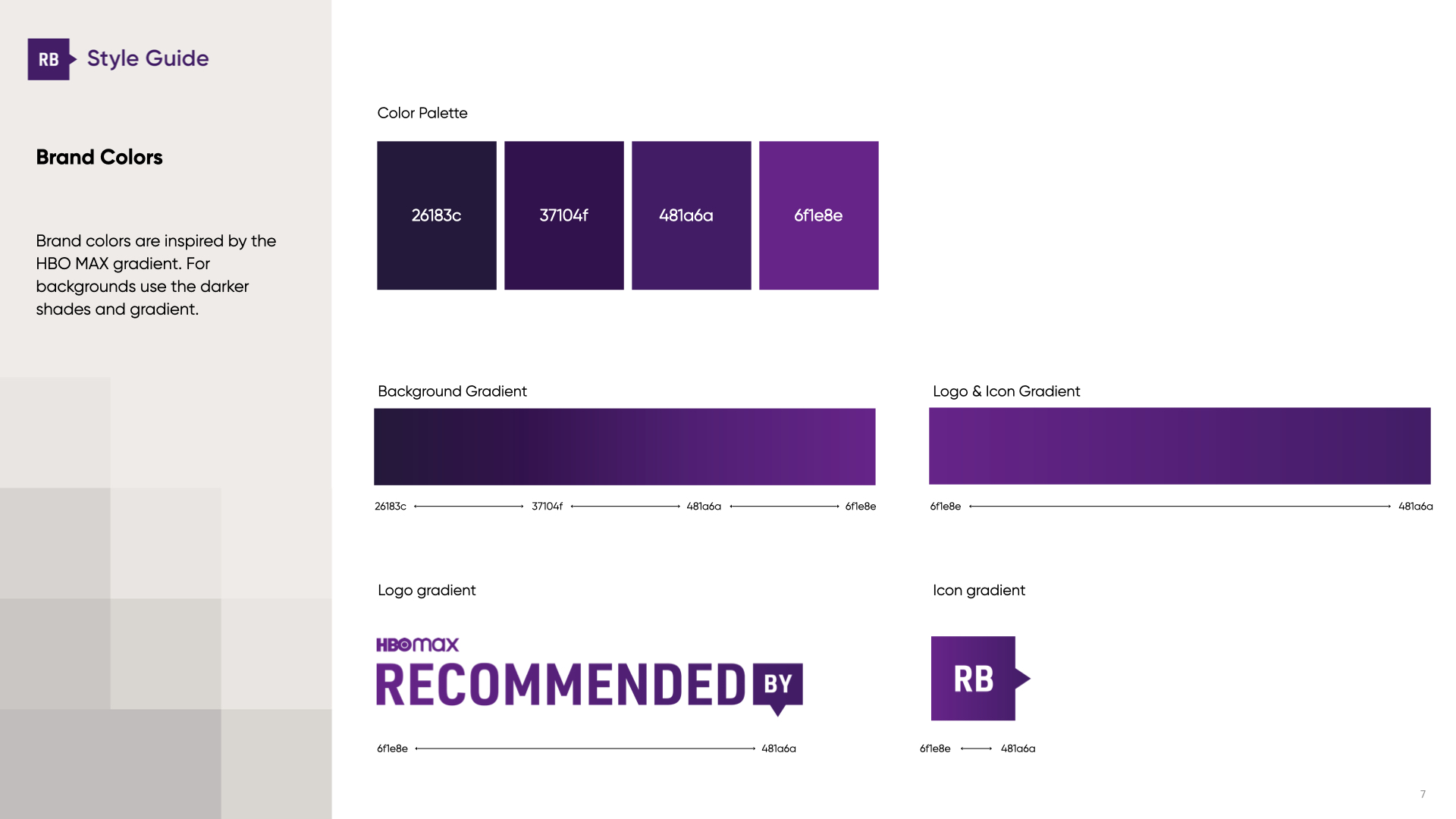
An underlying grid drove the entire identity. It created a dynamic mosaic effect pulled from the hero imagery itself, shifting in intensity to reflect different personalities and content. Negative space opened up when information needed clarity. The color palette was stripped down from the HBO MAX brand palette, letting talent and featured content take the spotlight.


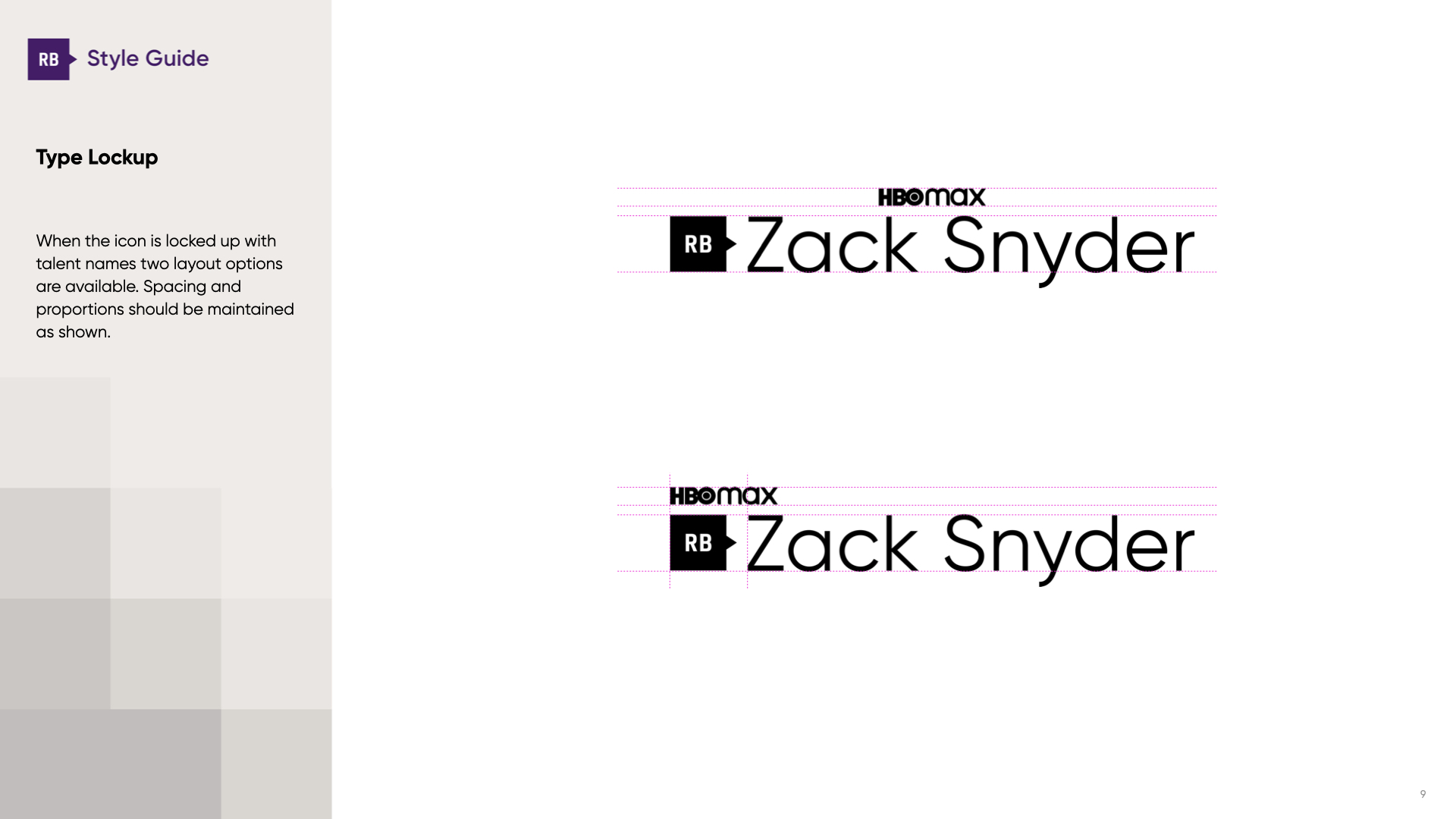
LOGO SYSTEM
The hero logo came in two main layout options, with an icon version for added flexibility. The icons only point left or down, always maintaining proportions and intent. For smaller applications, a “bug” version preserved legibility without losing recognition. A system designed to feel consistent, no matter the scale.
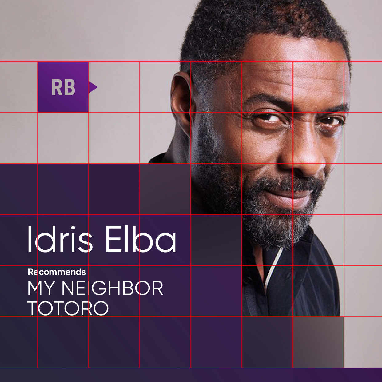
THE GRID MOSAIC
At the core of the brand was the Grid Mosaic: a square-based system that informed everything from the proportions of the logo to the transitions in motion. It reinterpreted the idea of a pixel — normally the hallmark of automation—and flipped it to frame real human imagery. In motion and key art, the grid took center stage as a bold texture; in interviews and longer-form programming, it receded, keeping focus on clean, uncluttered footage.