SUNDAYS
SUNDAY! SUNDAY! SUNDAY!
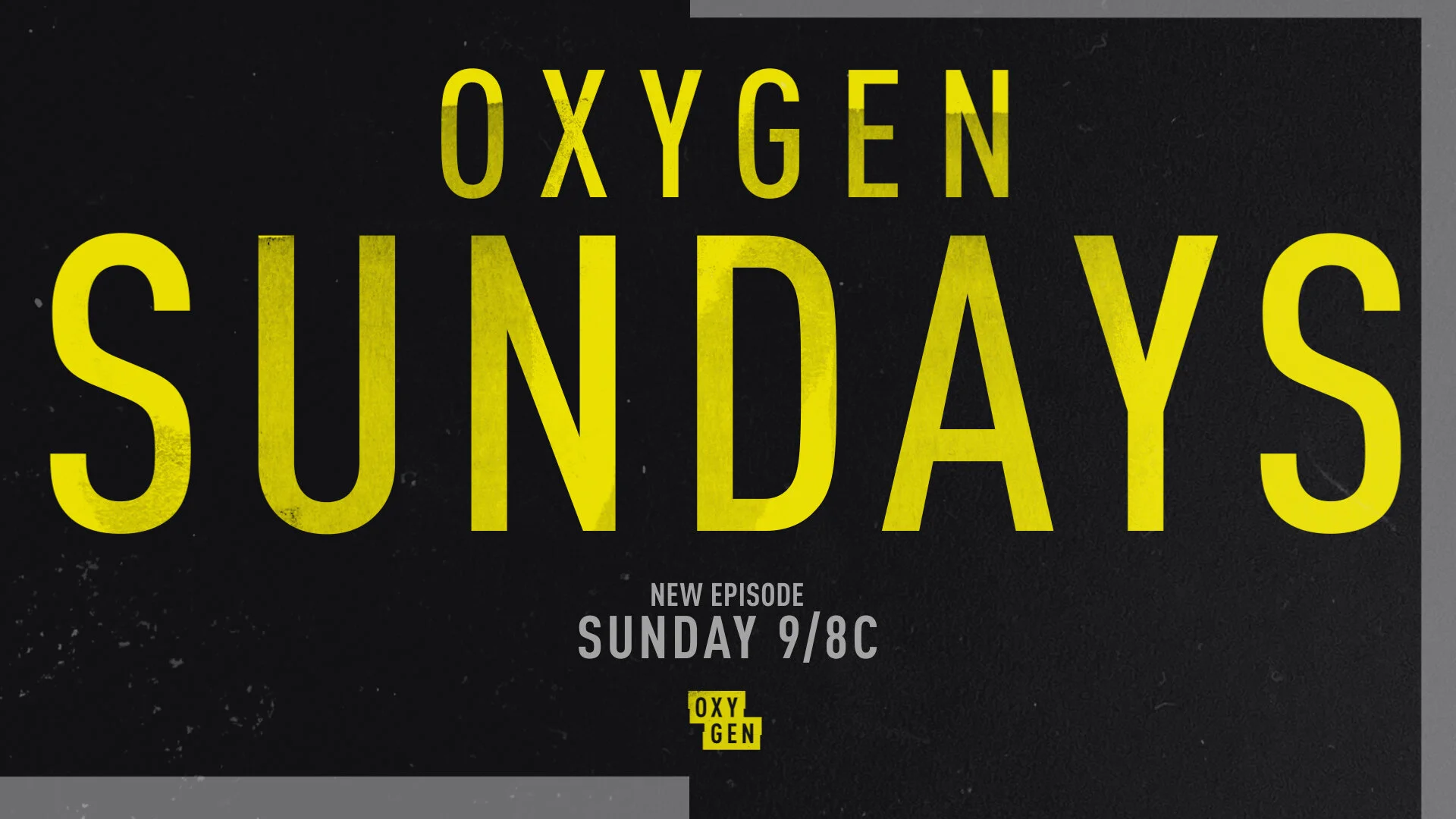
Oxygen is the go-to destination for binging true crime programming on Sundays. In an effort to drive home this unique position — and drive even more Sunday viewership — Kill 2 Birds was tapped to develop a distinctive brand identity for this programming block.
The network recently created a “Stunt” promo package, used specifically for combo spots, marathons, and events promotion. The Sundays brand identity needed to feel elevated from that stunt look and have a solid visual connection to the overall Oxygen brand universe.
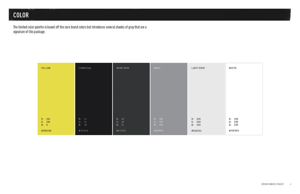
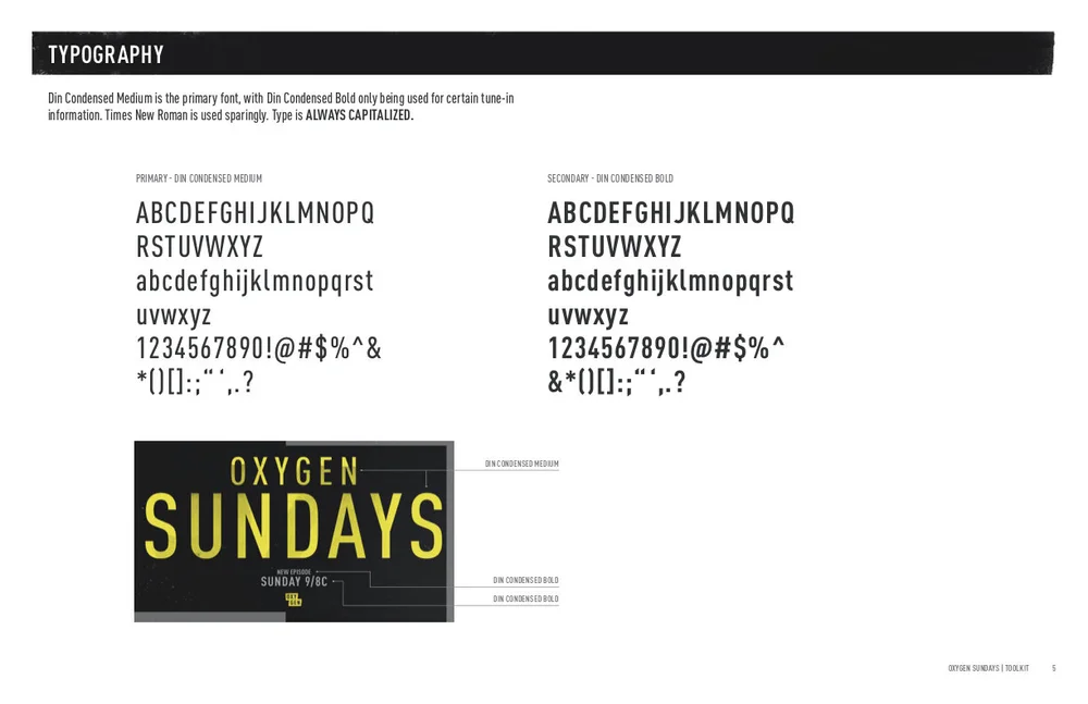
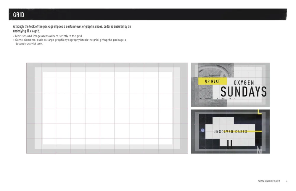
Inspired by the overlapping “Police Tape” rectangles of Oxygen’s network logo, our solution is a chaotic patchwork of yellow, white and black featuring oversized and unhinged typography. A strict underlying grid ensures a method to the madness and a robust “Mogrt” based toolkit gives editors a simple way to create graphics without relying on internal graphic teams.